

Role
UI/UX Designer
Platform
iOS Mobile App
Timeline
January 2026
Tools
Figma, FigJam, Notion
Background
For most students and young professionals in Nigeria, eating well is not a motivation problem. It is a friction problem. Long days and decision fatigue by 7pm mean people default to noodles or street food, not because they want to, but because everything else feels like too much effort.
EatRight was designed to sit inside that gap. Not another recipe app with a thousand options, but a food companion that reduces the daily decision load and meets you where you actually are.

Problem
The target user was not unmotivated. They were overwhelmed. Five friction points came up across every interview: meal planning felt like extra work, existing apps were built for power users, nutritional data meant nothing without context, food variety collapsed out of fear of wasting money, and grocery shopping was chaotic without a plan.
The insight that tied it together: this was not a recipe problem. It was a decision fatigue problem.
Approach
We built one persona to anchor every design decision: Alex, a 24-year-old junior marketing associate in Lagos. He leaves early, skips breakfast, delays lunch, and by 7pm he is too drained to cook. He rotates the same three meals, overspends on food, and tells himself he will plan better next week.
Every screen was stress-tested against one question: would Alex close the app here?


The competitive audit confirmed the market was split between high-effort personalization tools and convenience-first commerce platforms. Neither spoke to Alex. EatRight had room to exist as something different: guidance-first, simple enough for a first-timer, flexible enough for an unpredictable schedule, and culturally aware enough to feel relevant in Lagos.
Solution
The design moves Alex through a clear progression: earn his trust before asking anything, answer the daily "what do I eat?" question before he has to ask it, then give him tools to go deeper as his confidence grows.


Answering the question before it is asked
The home dashboard had one job: eliminate the daily "what do I eat today?" decision. The macro ring shows nutritional progress at a glance. "Today's Focus" surfaces a single hero meal with a direct "Start Cooking" CTA. Breakfast, lunch, and dinner sit in a scannable list below. The full weekly plan is available but secondary. The hierarchy is deliberate: the most important thing is what to eat right now.

A meal plan that bends without breaking
Static weekly plans fail the moment real life hits. The planner anticipates deviation and makes adjusting easier than abandoning the plan. Each day shows prep time and calories, just enough to make a quick swap decision. The most considered moment in the design was the empty state: instead of a blank tile, the app offers three specific paths. Add from Favorites. Browse Recipes. Suggest for Me. Deviation is treated as a feature, not a failure.


Discovery that does not overwhelm
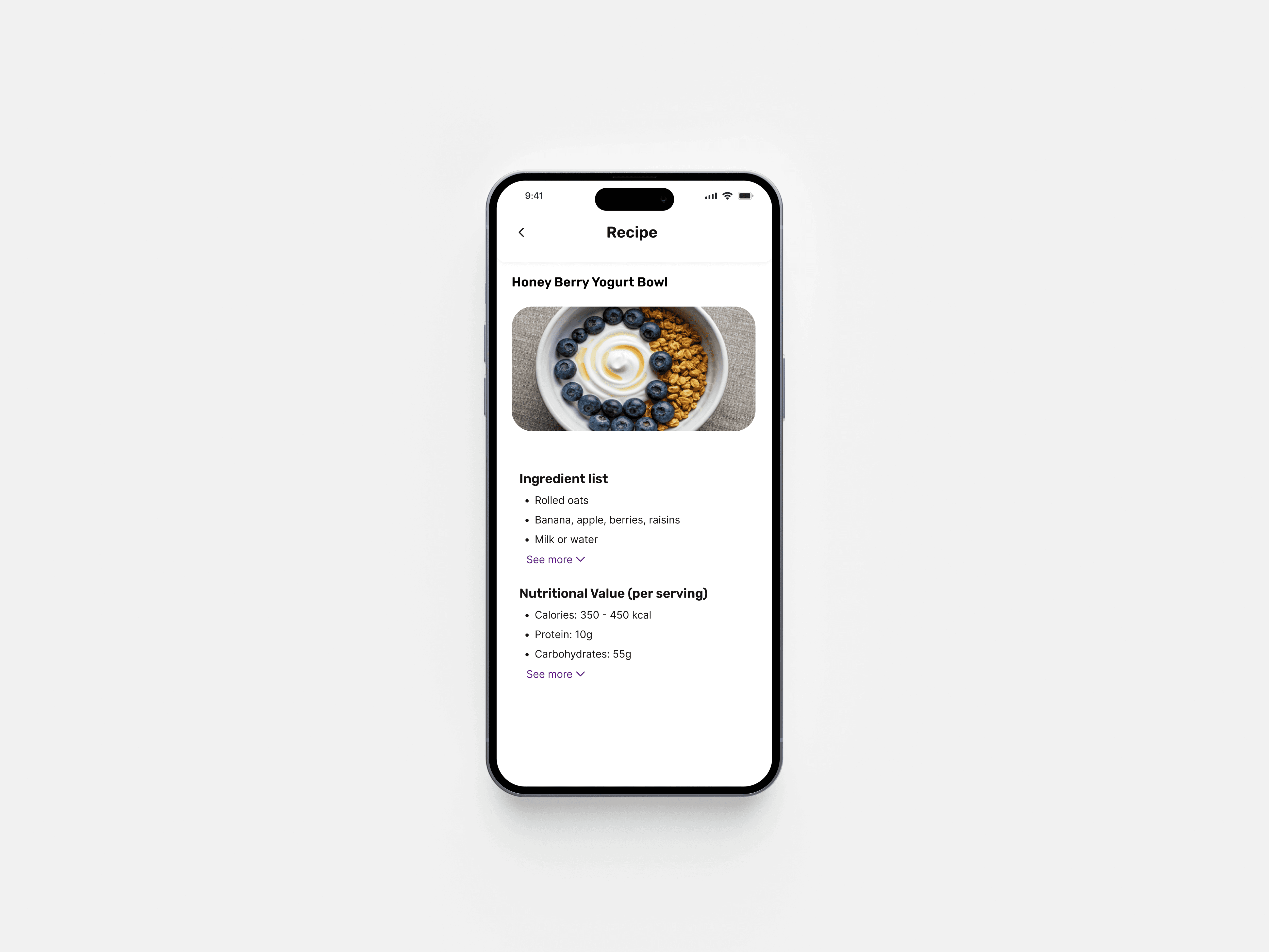
An unfiltered library of a thousand recipes is decision paralysis in a different form. Recipes are surfaced through curated layers by meal type, cuisine, and cultural context. Filtering by "Jollof" surfaces Nigerian-specific variants with protein and calorie data. This was not a feature. It was a signal: this app was built for you. That kind of relevance builds trust faster than any onboarding copy.

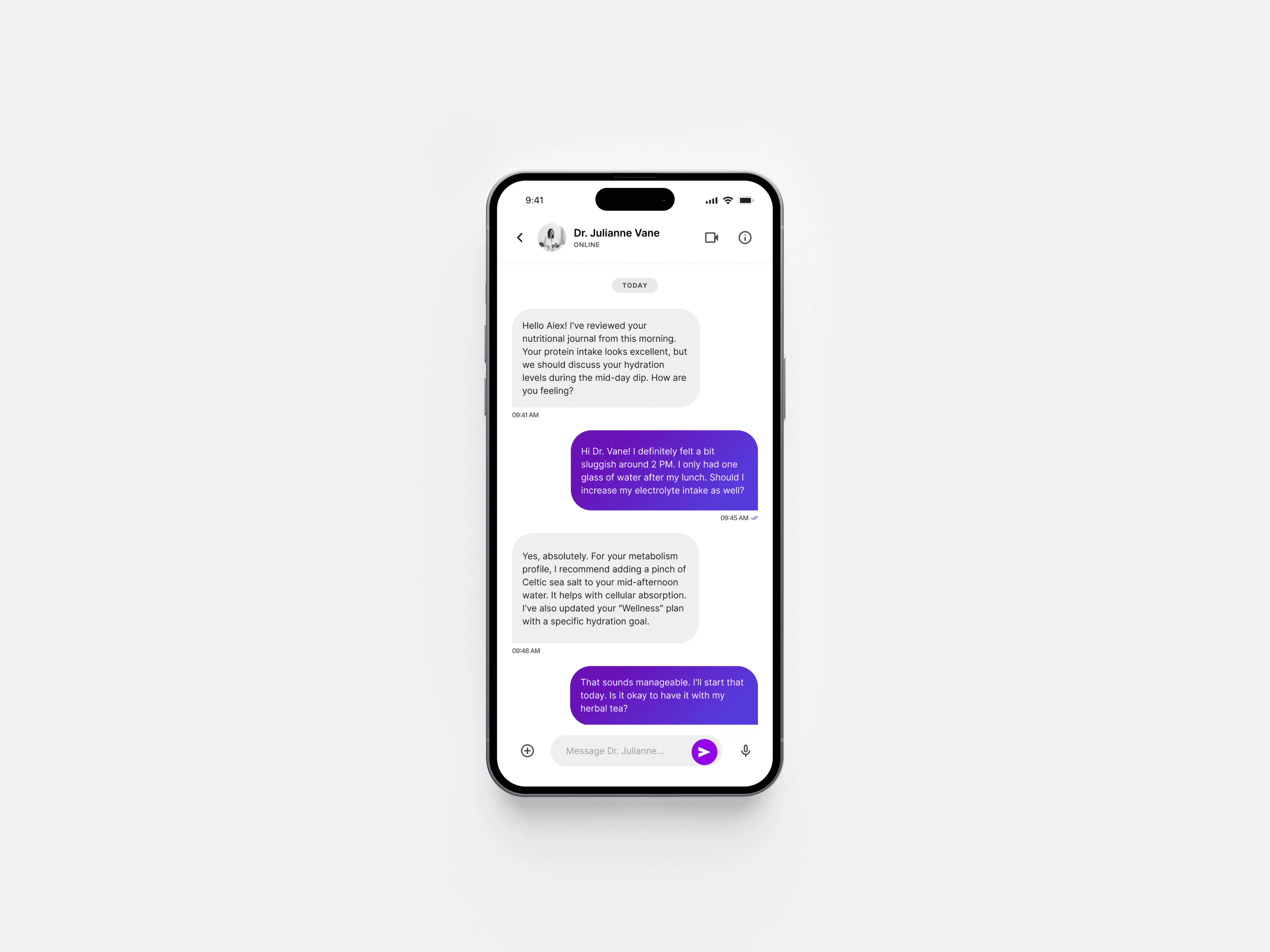
Support for every level of need
Some questions an app can answer. Some require a human. The AI nutritionist handles everyday guidance. The expert booking flow connects users with vetted specialists, with credentials, availability, session type, and pricing all on one screen. The in-app consultation makes it feel like a high-quality interaction, not a chatbot workaround.


Outcomes
Against direct competitors, EatRight was the only product to deliver cultural recipe relevance, contextual nutrition education, in-app specialist booking, and beginner-friendly onboarding in a single experience.
Learnings
The most impactful decisions in this sprint were copy decisions, not layout decisions. Small moments of care are what separate an app people open once from one that becomes a habit.
If I were to push further, I would A/B test the 4-step onboarding against a 2-step version and measure drop-off by step. The broader takeaway: designing for an overwhelmed user means every extra tap, every ambiguous label, every unanswered question is a reason to close the app. The best move is almost always to do less, better.
Other Projects

Powerwise
Designed a platform to track usage, prevent outages, and enable secure payments.
UI/UX Design
UX Research

HomeTrust
A platform offering verified listings, transparent pricing, and tenancy info to prevent disputes.
UI/UX Design
UX Research